Branding
Prairie Chocolate
Learn how we redefined Prairie Chocolate's identity, transforming delicious treats into lasting memories.
Follow
Branding
Prairie Chocolate
Learn how we redefined Prairie Chocolate's identity, transforming delicious treats into lasting memories.
Follow
About the Project
About the Project
About the Project
Prairie Chocolate Co., a distinguished chocolate manufacturer based in Alberta, Canada, is renowned for its high-quality artisan chocolates that embody the essence of the region. With a strong local heritage, the company decided to undertake a comprehensive rebranding to enhance its market presence and align its visual identity with its brand values and regional roots.
Prairie Chocolate Co., a distinguished chocolate manufacturer based in Alberta, Canada, is renowned for its high-quality artisan chocolates that embody the essence of the region. With a strong local heritage, the company decided to undertake a comprehensive rebranding to enhance its market presence and align its visual identity with its brand values and regional roots.


The Challenge
The Challenge
The Challenge
The original branding of Prairie Chocolate Co., while familiar to its loyal customer base, lacked the contemporary edge and cohesion needed to compete in an increasingly sophisticated market.
The goal was to develop a visual identity that not only represented the quality and richness of the chocolates but also paid homage to the unique landscapes of Alberta—namely, the Rocky Mountains and the Alberta Prairies.

The Solution
The Solution
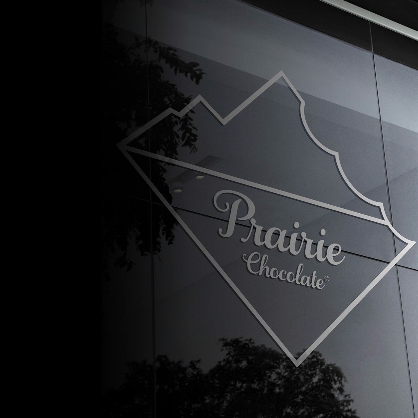
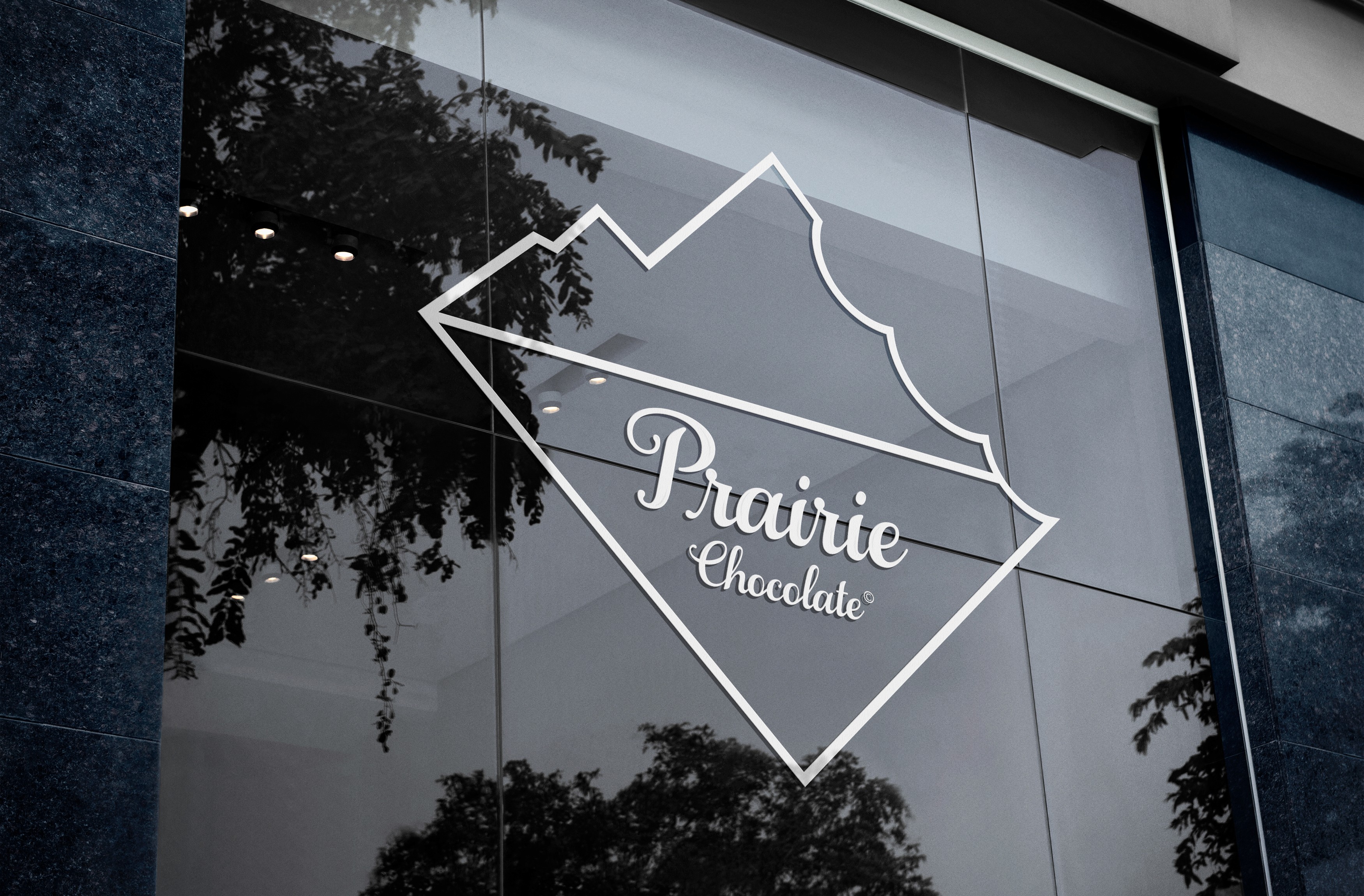
Recognizing the brand's extensive market presence, we designed an identity that beautifully captures the essence of Alberta's Prairies. The unique landscape and feel of the region are woven into the logo, fonts, and colors of the brand, celebrating Alberta's distinctiveness and inspiring a connection to its breathtaking beauty.
Logo Breakdown
Logo Breakdown
Logo Breakdown
The Solution
Recognizing the brand's extensive market presence, we designed an identity that beautifully captures the essence of Alberta's Prairies. The unique landscape and feel of the region are woven into the logo, fonts, and colors of the brand, celebrating Alberta's distinctiveness and inspiring a connection to its breathtaking beauty.


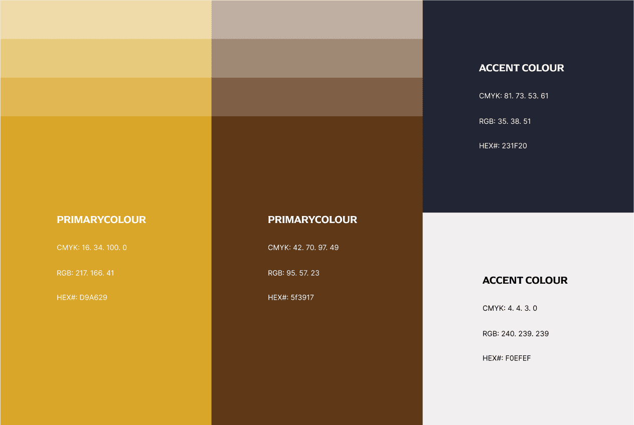
Colour Pallet & Fonts
Colour Pallet & Fonts
Colour Pallet & Fonts
Our choice of rich brown colour serves a constructive purpose by fostering a sense of comfort and familiarity, akin to the delightful experience of enjoying chocolate. This inviting hue encourages a welcoming atmosphere that can enhance any space. In contrast, our vibrant yellow draws inspiration from the beautiful Alberta prairies, symbolizing the warmth of sunlit landscapes.
Our fonts are Arpona for headlines and subtitles and Aileron for the body copies.
Typography
Typography
Aa
Aa
abcdefghijklmnopqrstuvwxyz
ABCDEFGHIJKLMNOPQRSTUVWXYZ
1234567890?!*+(.,)
The Brown Fox Headline
The quick brown fox jumps over the lazy dog
Lorem ipsum dolor sit amet, consectetur adipiscing elit. Sed do eiusmod tempor incididunt ut labore et dolore magna aliqua. Ut enim ad minim veniam, quis nostrud exercitation ullamco laboris nisi ut aliquip ex ea commodo consequat. Duis aute irure dolor in reprehenderit in voluptate velit esse cillum dolore eu fugiat nulla pariatur. Excepteur sint occaecat cupidatat non proident, sunt in culpa qui officia deserunt mollit anim id est laborum.
-
Colour Palette
Colour Palette
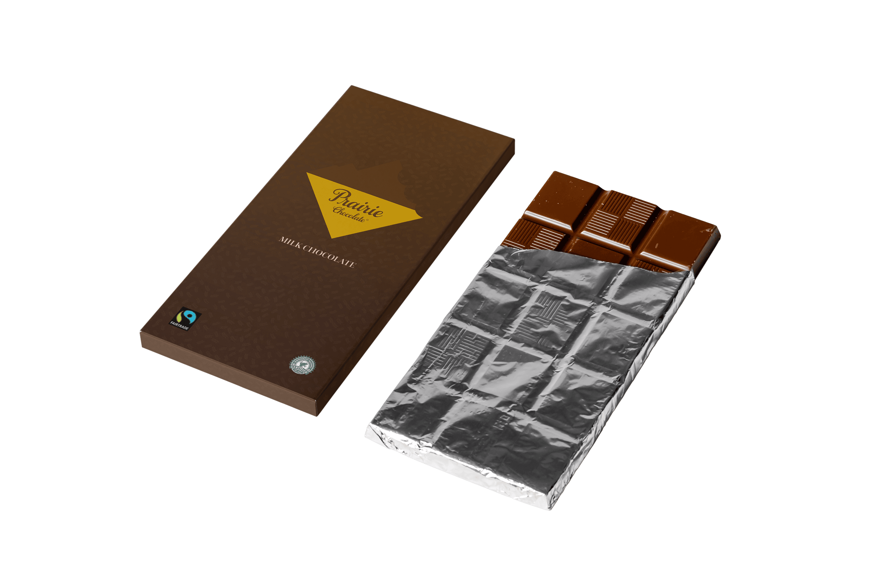
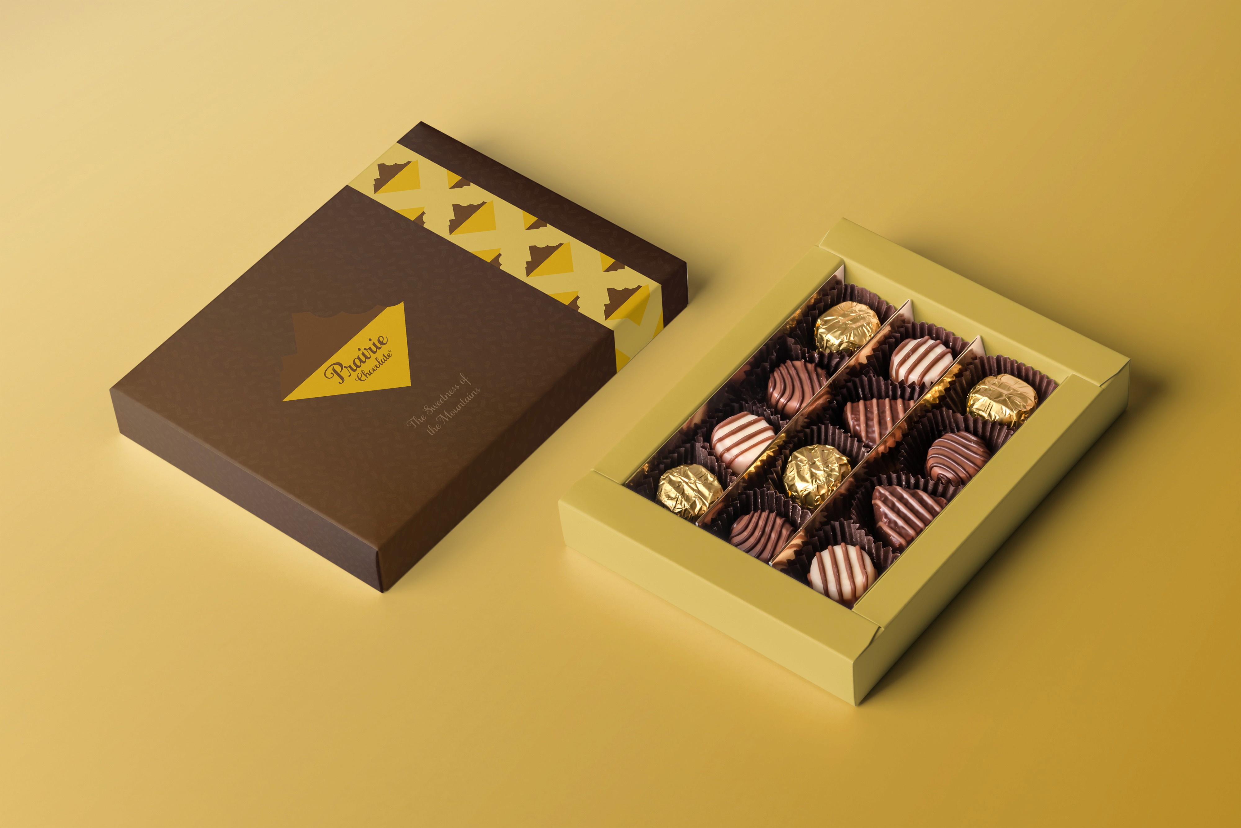
Brand Application
Brand Application
Brand Application
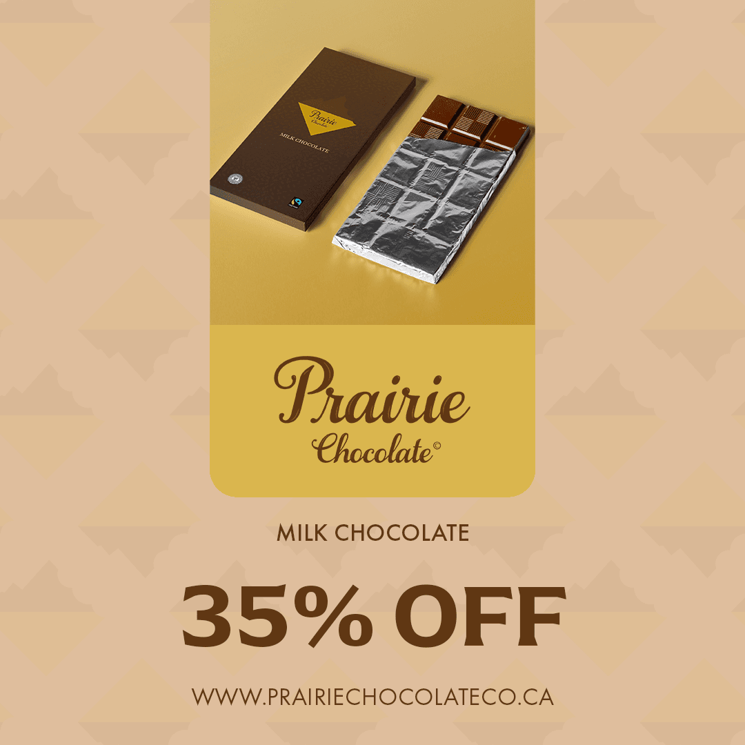
The mockups were created to bridge the gap between the visual concept of the brand and reality, showcasing the brand application in different products.
The mockups were created to bridge the gap between the visual concept of the brand and reality, showcasing the brand application in different products.
The mockups were created to bridge the gap between the visual concept of the brand and reality, showcasing the brand application in different products.
-
Aa
Aa
abcdefghijklmnopqrstuvwxyz
ABCDEFGHIJKLMNOPQRSTUVWXYZ
1234567890?!*+(.,)
The Brown Fox Headline
The quick brown fox jumps over the lazy dog
Lorem ipsum dolor sit amet, consectetur adipiscing elit. Sed do eiusmod tempor incididunt ut labore et dolore magna aliqua. Ut enim ad minim veniam, quis nostrud exercitation ullamco laboris nisi ut aliquip ex ea commodo consequat. Duis aute irure dolor in reprehenderit in voluptate velit esse cillum dolore eu fugiat nulla pariatur. Excepteur sint occaecat cupidatat non proident, sunt in culpa qui officia deserunt mollit anim id est laborum.
Typography
-
Aa
Aa
abcdefghijklmnopqrstuvwxyz
ABCDEFGHIJKLMNOPQRSTUVWXYZ
1234567890?!*+(.,)
The Brown Fox Headline
The quick brown fox jumps over the lazy dog
Lorem ipsum dolor sit amet, consectetur adipiscing elit. Sed do eiusmod tempor incididunt ut labore et dolore magna aliqua. Ut enim ad minim veniam, quis nostrud exercitation ullamco laboris nisi ut aliquip ex ea commodo consequat. Duis aute irure dolor in reprehenderit in voluptate velit esse cillum dolore eu fugiat nulla pariatur. Excepteur sint occaecat cupidatat non proident, sunt in culpa qui officia deserunt mollit anim id est laborum.


Conclusion
Conclusion
Conclusion
Prairie Chocolate Co.'s successful rebranding demonstrates the power of thoughtful design in articulating a company's story while appealing to aesthetic sensibilities and regional pride. This case study exemplifies how strategic branding can transform a brand's perception, fostering growth and strengthening customer loyalty.
Prairie Chocolate Co.'s successful rebranding demonstrates the power of thoughtful design in articulating a company's story while appealing to aesthetic sensibilities and regional pride. This case study exemplifies how strategic branding can transform a brand's perception, fostering growth and strengthening customer loyalty.
Prairie Chocolate Co.'s successful rebranding demonstrates the power of thoughtful design in articulating a company's story while appealing to aesthetic sensibilities and regional pride. This case study exemplifies how strategic branding can transform a brand's perception, fostering growth and strengthening customer loyalty.
Branding
Getaway Stay
Getaway Stay
Getaway Stay
Discover how we crafted a Brand Identity for Getaway Stay
Discover how we crafted a Brand Identity for Getaway Stay.
Discover how we crafted a Brand Identity for Getaway Stay

Need a custom quote?
Don’t let your ideas sit idle—slide into our inbox and let’s make magic!
Need a custom quote?
Don’t let your ideas sit idle—slide into our inbox and let’s make magic!
Need a custom quote?
Don’t let your ideas sit idle—slide into our inbox and let’s make magic!